Sharing and caring:
Advocating and educating
as inaugural UX designer ♿️
♿️
Sharing and caring: Advocating, educating as inaugural
UX designer


Context
Client
Wolf is a learning consultancy for the animal health industry, producing e-learning courses and other material for companies in the veterinarian, farm, pet food, animal pharmaceutical, and other associated industries.
Most of the projects I worked on at Wolf I am unable to show due to client confidentiality.
Paradoxically, I was a UX design apprentice but the first and only UX designer in the company. However, while there, I took the initiative to advocate for users, educating colleagues and freelancers on user-centred, inclusive, and accessible design principles.
• Tools: Figma, Adobe Photoshop and Illustrator, Articulate Storyline and Rise, Microsoft PowerPoint, Excel, and Teams.
• Timeline: July 2021 - July 2023
• Role: UX designer, UX researcher, UX writer, accessibility specialist.
Contents
Website redesign: UX and accessibility
Website redesign:
UX and accessibility
Problem
Wolf Learning Consulting was rebranding and the old website needed updating to match. However, the redesign was created by a graphic designer and didn't follow UX and accessibility guidlines in several areas.
The main redesign was done without consulting me, but I was able to give my input at a later stage.
Unfortunately, Wolf also wasn't willing to set up analytics or test with users.
Solution
Suggested usability an accessibility improvements to the new website while applying the company's recent rebrand (colours, font, style, etc.).
Not all of my suggestions were implemented, but throughout I followed best practices and accessibility guidelines, explained the reasoning for my recommendations, aiming to improve the UX as much as possible within the constraints.
Applied suggestions
Button colour
Originally the Call-To-Action (CTA) buttons were the same green as the rest of the brand.
I recommended changing the buttons to the tertiary brand blue (pictured below), to make them stand out from the rest of the green used throughout the design.
The intent was to make them easier to distinguish and thus ease user frustration and increase clickthrough rates.
Yellow underline
I suggested implementing an animated brand yellow underline for key words in bold green sections. This yellow underline was then additionally implemented in further brand documents such as presentation slide decks and social media graphics.

Text colour
I suggested making the green text bold to pass the Web Content Accessibility Guidelines (WCAG) colour contrast requirements.

Left-aligning paragraph text
I suggested making all paragraph text (like this) left-aligned, as this increases readability.
Applied suggestions
Button colour
Originally the Call-To-Action (CTA) buttons were the same green as the rest of the brand.
I recommended changing the buttons to the tertiary brand blue (pictured below), to make them stand out from the rest of the green used throughout the design.
The intent was to make them easier to distinguish and thus ease user frustration and increase clickthrough rates.
Yellow underline
I suggested implementing an animated brand yellow underline for key words in bold green sections. This yellow underline was then additionally implemented in further brand documents such as presentation slide decks and social media graphics.
Text colour
I suggested making the green text bold to pass the Web Content Accessibility Guidelines (WCAG) colour contrast requirements.
Left-aligning paragraph text
I suggested making all paragraph text (like this) left-aligned, as this increases readability.
Non-applied suggestions
• Changing certain buttons that were still green to blue, to improve consistency (WCAG Consistent Identification).
• Adding an option to pause the auto-playing animations and carousels, to improve accessibility in line with WCAG 2.2.2: Pause, Stop Hide.
• Not having text inside images, as screen readers can't extract text from images, so the site is less accessible (WCAG Images of Text).
• Increasing the font size, weight, and/or colour of eyebrow text (such as 'Our strengths' above) to pass WCAG Colour Contrast.
• Providing alt text for images, to make them accessible to screen readers (WCAG's Text Alternative).
Interview design task
Interview design task
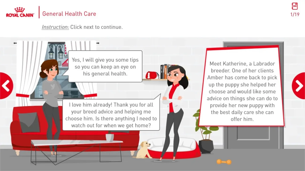
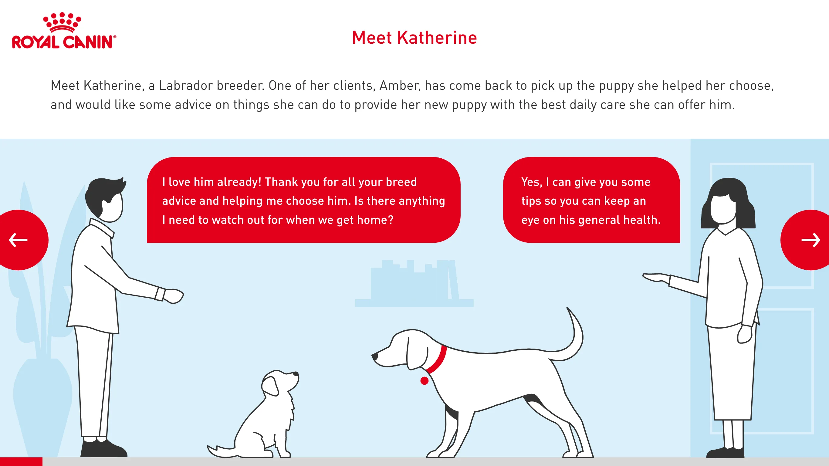
Problem
Design task brief: When interviewing for Wolf, I was given a brief to 'make the UX smoother or even more engaging for the learner' while following the client's brand guidelines.
Problem
Design task brief: When interviewing for Wolf, I was given a brief to 'make the UX smoother or even more engaging for the learner' while following the client's brand guidelines.
Solution
Suggested ways to improve the user experience, while applying Royal Canin's brand guidlines. I also took the initiative to ask the CEO of Wolf if they had any existing Royal Canin assets to be more efficient while adhering to brand guidlines. He appreciated the initiative and provided me with some assets.
View all screens
View reasoning
UX guide

UX guide
Problem
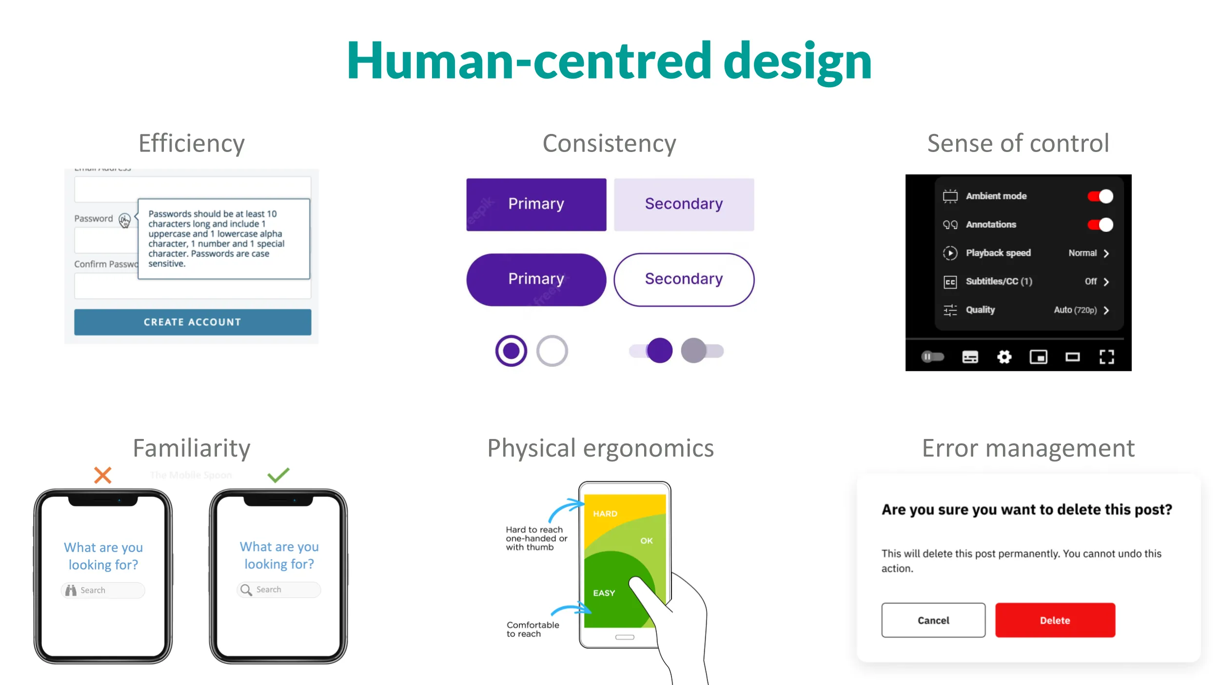
The freelance graphic designers that I worked with to create the e-learning courses weren't aware of UX and accessibility, so would create visual designs that weren't intuitive, designed for interaction, or accessible.
Problem
The freelance graphic designers that I worked with to create the e-learning courses weren't aware of UX and accessibility, so would create visual designs that weren't intuitive, designed for interaction, or accessible.
Solution
I created a guide covering some UX and accessibility best practices, with visual examples and links to resources.
View UX guide
Solution
I created a guide covering some UX and accessibility best practices, with visual examples and links to resources.
View UX guide
Project wireframes

Project wireframes
Problem
The client wanted a lot of pack-shots and information in the course. However, this made for an extremely crowded interface.
Problem
The client wanted a lot of pack-shots and information in the course. However, this made for an extremely crowded interface.
Solution
I discussed with the client and developer and created some initial wireframes based on the requirements. I then presented these back to the developer and we iterated together. We then presented our findings back to the client, who accepted the proposed changes.
Unfortunately, like all the projects I worked on at Wolf, the client wasn't willing to test with end users.
View Figma file
User research report
User research report
Problem
Wolf didn't have a framework in place for gathering user feedback, and despite my asking, clients wouldn't allow testing with users either.
Problem
Wolf didn't have a framework in place for gathering user feedback, and despite my asking, clients wouldn't allow testing with users either.
Solution
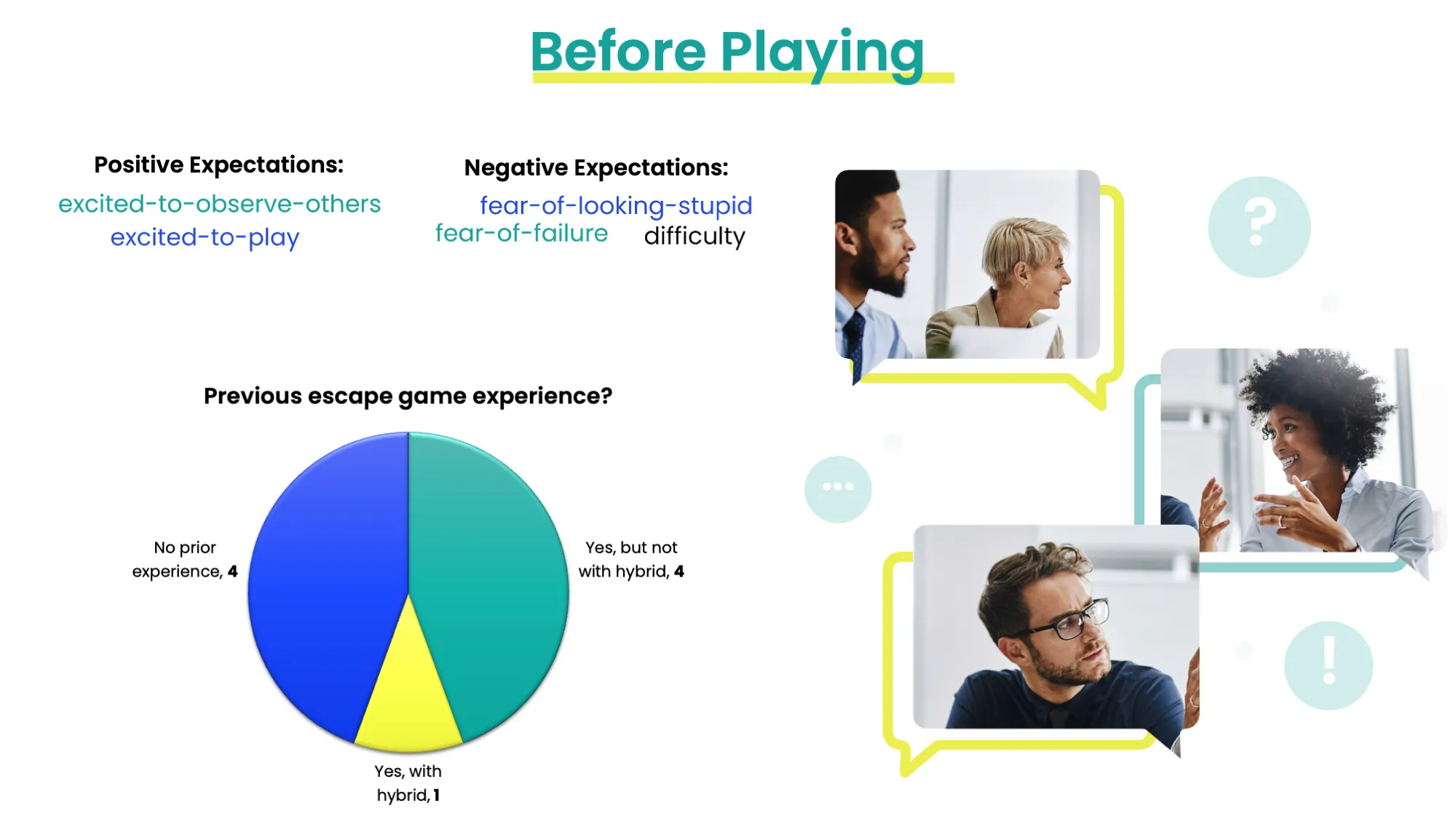
I conducted user research for a hybrid card and app-based escape game, which was sent to staff and clients for Christmas 2022.
I was only able to get feedback from Wolf staff, but even this produced some insights, which I formed into actionable feedback for future escape games.
View full report
Solution
I conducted user research for a hybrid card and app-based escape game, which was sent to staff and clients for Christmas 2022.
I was only able to get feedback from Wolf staff, but even this produced some insights, which I formed into actionable feedback for future escape games.
View full report
Felpreva UX suggestions

Felpreva UX suggestions
Problem
The project for Felpreva had some UX issues in terms of consistency.
Problem
The project for Felpreva had some UX issues in terms of consistency.
Solution
I suggested improvements and also created a before/after slider with my reasoning to educate colleagues about UX.
View interactive versions below. Drag the pink circle to see before/after.
View first screen
View second screen
Solution
I suggested improvements and also created a before/after slider with my reasoning to educate colleagues about UX.
View interactive versions below. Drag the pink circle to see before/after.
View first screen
View second screen
Deque Axecon 2023 report
Deque Axecon 2023 report
Problem
There was a lack of knowledge about accessibility at Wolf, it wasn't considered or even known about.
Problem
There was a lack of knowledge about accessibility at Wolf, it wasn't considered or even known about.
Solution
I posted weekly about accessibility and UX in a dedicated UX tips channel and giving feedback around the Web Content Accessibility Guidelines (WCAG).
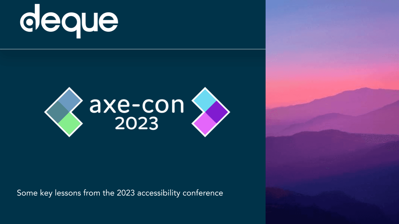
I also attended Axecon 2023 (digital accessibility conference) and I gave a presentation colleagues about my learnings.
View Axecon slides
Solution
I posted weekly about accessibility and UX in a dedicated UX tips channel and giving feedback around the Web Content Accessibility Guidelines (WCAG).
I also attended Axecon 2023 (digital accessibility conference) and I gave a presentation colleagues about my learnings.
View Axecon slides
UX webinar
UX webinar
Problem
I was the first UX designer at Wolf, so colleagues didn't know what UX was, where I could fit in, what I could help with, or what the point of my role was.
Problem
I was the first UX designer at Wolf, so colleagues didn't know what UX was, where I could fit in, what I could help with, or what the point of my role was.
Solution
I co-hosted a webinar about UX, educating my colleagues about UX as a field with some examples of best practices.
View webinar slides
Solution
I co-hosted a webinar about UX, educating my colleagues about UX as a field with some examples of best practices.
View webinar slides
UX tips posts
UX tips posts
Problem
I was the first UX designer at Wolf, so colleagues didn't know what UX was, where I could fit in, what I could help with, or what the point of my role was.
Problem
I was the first UX designer at Wolf, so colleagues didn't know what UX was, where I could fit in, what I could help with, or what the point of my role was.
Solution
I created a Microsoft Teams channel called 'UX Tips' and posted best practices weekly. These would come with examples and links to further reading. They would often have examples from current or previous e-learning courses that Wolf had produced.
An example can be seen on my LinkedIn. The Felpreva before/after visual above was also created for a UX tips post.
View UX tip
Solution
I created a Microsoft Teams channel called 'UX Tips' and posted best practices weekly. These would come with examples and links to further reading. They would often have examples from current or previous e-learning courses that Wolf had produced.
An example can be seen on my LinkedIn. The Felpreva before/after visual above was also created for a UX tips post.